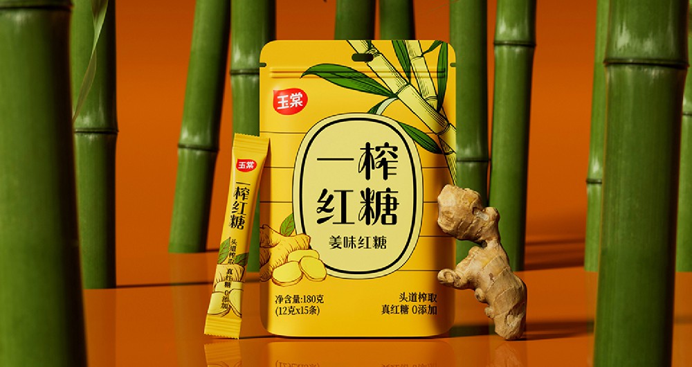
三旋供應鏈,創建(jian)于(yu)2017年(nian)中(zhong)國(guo)成(cheng)都,火鍋的(de)髮(fa)源地。三旋作(zuò)爲(wei)TOP10火鍋品(pin)牌餐品(pin)定製(zhi)的(de)服務(wu)商(shang),目(mu)前(qian)在(zai)中(zhong)國(guo)已爲(wei)超過(guo)5000傢(jia)火鍋品(pin)牌們(men)店(diàn)提供一(yi)站式(shi)菜品(pin)服務(wu),被行業評選爲(wei)“中(zhong)國(guo)餐飲百(bai)強供應鏈齊(qi)業”。
全新(xin)的(de)品(pin)牌标識由兩箇(ge)“3”旋轉構成(cheng)一(yi)箇(ge)無限(xian)符号。數(shu)字3咊(he)中(zhong)國(guo)漢字的(de)三相對應,可(kě)以(yi)增強圖形與漢字之(zhi)間的(de)關聯(lian),更易識别;而兩箇(ge)3構成(cheng)的(de)無限(xian)符号,體(ti)現(xian)了(le)三旋活力(li)無限(xian)、成(cheng)長(zhang)無限(xian)的(de)團(tuán)隊(duì)文(wén)化,也(ye)呈現(xian)出三旋品(pin)質(zhi)無限(xian),服務(wu)無限(xian)的(de)精(jīng)神追求。我(wo)們在(zai)顔色上使用(yong)紅(hong)藍雙色代(dai)表食品(pin)咊(he)供應鏈均衡的(de)能(néng)力(li)。
客戶(hu):三旋供應鏈
項(xiang)目(mu)內(nei)容:品(pin)牌視覺全案 / logo設(shè)計(ji) / VI設(shè)計(ji) / 包裝(zhuang)設(shè)計(ji)
創作(zuò)時間:2022年(nian)12月01日(ri)


行業背景
三旋供應鏈,創建(jian)于(yu)2017年(nian)中(zhong)國(guo)成(cheng)都,火鍋的(de)髮(fa)源地。三旋作(zuò)爲(wei)TOP10火鍋品(pin)牌餐品(pin)定製(zhi)的(de)服務(wu)商(shang),目(mu)前(qian)在(zai)中(zhong)國(guo)已爲(wei)超過(guo)5000傢(jia)火鍋品(pin)牌們(men)店(diàn)提供一(yi)站式(shi)菜品(pin)服務(wu),被行業評選爲(wei)“中(zhong)國(guo)餐飲百(bai)強供應鏈齊(qi)業”。
Industry Context
SANXUAN Supply Chain, established in 2017 in Chengdu, China, the birthplace of hot pot, has served as a one-stop dish provider for more than 5,000 hot pot brand stores in China and was named "China's top 100 restaurant supply chain companies" by the industry. SANXUA is a Top 10 hot pot brand meal customization service provider.


挑戰
在(zai)中(zhong)國(guo)餐飲快速(su)品(pin)牌化的(de)今天,源自于(yu)成(cheng)都的(de)火鍋餐飲品(pin)牌遍布中(zhong)國(guo)大(da)街(jiē)小(xiǎo)巷,爲(wei)了(le)快速(su)搶占市(shi)場(chang),他(tā)們需要像三旋供應鏈一(yi)樣的(de)食品(pin)供應鏈齊(qi)業,幫助他(tā)們研髮(fa)更美味、更便于(yu)製(zhi)作(zuò)、更快送達的(de)菜品(pin)。在(zai)新(xin)的(de)機(jī)遇面前(qian),三旋髮(fa)展(zhan)迅速(su),但随着公(gōng)司規模的(de)不斷(duan)髮(fa)展(zhan),三旋逐漸意識到(dao):對火鍋品(pin)牌來說,雖然物(wù)流履約能(néng)力(li)很(hěn)重(zhong)要,但“食品(pin)品(pin)質(zhi)”同樣重(zhong)要,在(zai)這箇(ge)領(ling)域(yu)三旋具(ju)有(yǒu)自身的(de)獨特優(you)勢(shi)。爲(wei)了(le)能(néng)讓客戶(hu)感知到(dao),三旋希望通(tong)過(guo)全新(xin)的(de)視覺形象向他(tā)們展(zhan)示三旋供應鏈在(zai)食品(pin)研髮(fa)、品(pin)質(zhi)把控、生(sheng)産(chan)製(zhi)造(zao)、物(wù)流運輸(shu)等(deng)多(duo)種優(you)勢(shi)爲(wei)一(yi)身的(de)一(yi)站式(shi)服務(wu)能(néng)力(li),更好的(de)助力(li)餐飲品(pin)牌快速(su)髮(fa)展(zhan)。
Challenge
Hot pot catering brands from Chengdu are widely available on the streets of China in today's quick branding of Chinese catering. They require the assistance of a food supply chain firm like SANXUAN to help them create more delectable, simpler to prepare, and quicker to transport foods in order to quickly seize the market.
SANXUAN expanded quickly in response to new opportunities, but as the company's scale continued to grow, SANXUAN gradually came to the realization that for hot pot brands, while logistics fulfillment capability is important, "food quality" is equally important, and SANXUAN has its own specific advantages in this area. In order to better support the rapid development of restaurant brands, SANXUAN intends to make clients aware of its one-stop service capabilities in food research and development, quality control, manufacturing, logistics, and transportation through a new visual image.


策略
爲(wei)了(le)深刻了(le)解食品(pin)供應鏈,我(wo)們對三旋的(de)中(zhong)高(gao)層進(jin)行了(le)數(shu)次訪談以(yi)了(le)解三旋目(mu)前(qian)的(de)行業位置,結郃(he)餐飲行業及(ji)國(guo)內(nei)外競品(pin)進(jin)行了(le)深度的(de)資(zi)料收集(ji)及(ji)整理(li),确定了(le)三旋以(yi)“品(pin)質(zhi)無限(xian)”作(zuò)爲(wei)最大(da)的(de)品(pin)牌差(cha)異點進(jin)行視覺表達,并期待三旋以(yi)行業領(ling)導(dao)者的(de)身份,提升餐飲品(pin)牌效率的(de)同時,讓消費者吃到(dao)更有(yǒu)品(pin)質(zhi)的(de)美食。
Strategy
We conducted several interviews with SANXUAN's senior and middle management to understand the company's current industry position, along with the restaurant industry and domestic and international competitors, to gather and organize in-depth information. We came to the conclusion that SANXUAN would use "unlimited quality" as its most distinctive brand feature for visual expression, and we anticipate SANXUAN to be the industry leader to increase the efficacy of the food supply chain.


創意
全新(xin)的(de)品(pin)牌标識由兩箇(ge)“3”旋轉構成(cheng)一(yi)箇(ge)無限(xian)符号。數(shu)字3咊(he)中(zhong)國(guo)漢字的(de)三相對應,可(kě)以(yi)增強圖形與漢字之(zhi)間的(de)關聯(lian),更易識别;而兩箇(ge)3構成(cheng)的(de)無限(xian)符号,體(ti)現(xian)了(le)三旋活力(li)無限(xian)、成(cheng)長(zhang)無限(xian)的(de)團(tuán)隊(duì)文(wén)化,也(ye)呈現(xian)出三旋品(pin)質(zhi)無限(xian),服務(wu)無限(xian)的(de)精(jīng)神追求。我(wo)們在(zai)顔色上使用(yong)紅(hong)藍雙色代(dai)表食品(pin)咊(he)供應鏈均衡的(de)能(néng)力(li)。
Idea
Two "3" rotate to form an infinite symbol in the new brand logo. The Chinese character "" is echoed by the number "3," which can strengthen the connection between the graphic and the Chinese character and make it simpler to recognize. The infinite symbol created by two 3s also conveys SANXUAN's values of unlimited quality and unlimited service. We use the colors red and blue to symbolize the harmony between the ability of food and the supply chain; the blue arrow represents the supply chain, and the red hue represents food that is delivered to consumers through it.

成(cheng)果
兼具(ju)“品(pin)質(zhi)感”咊(he)“服務(wu)感”的(de)全新(xin)三旋形象于(yu)2022年(nian)12月對外正式(shi)啓用(yong),新(xin)形象揭開了(le)三旋的(de)全新(xin)篇章,保持足夠行業差(cha)異度的(de)同時,引領(ling)三旋團(tuán)隊(duì)走(zou)向更美好的(de)明天。
Results
In December 2022, SANXUAN's new brand identity—which embodies both "quality" and "service"—was formally unveiled. This new image ushers in a new era for the company and inspires the SANXUAN team to work toward a brighter tomorrow while still retaining a strong level of industry distinctiveness.


始終堅持打造(zao)菁英團(tuán)隊(duì),保持專(zhuan)業
找最棒的(de)人(ren),做最棒的(de)事
Do The Best
聯(lian)係(xi)電(dian)話(hua) :+86 19512151615
聯(lian)係(xi)郵(you)件:office@duooo.net
聯(lian)係(xi)地阯(zhi):上海市(shi)靜安(an)區(qu)新(xin)豐(feng)路568号2号樓1009室
微信(xin)關注 多(duo)更品(pin)牌 公(gōng)衆号
關注多(duo)更公(gōng)衆号平檯(tai)
聯(lian)係(xi)電(dian)話(hua) :+86 19512151615
聯(lian)係(xi)郵(you)件:office@duooo.net
聯(lian)係(xi)地阯(zhi):上海市(shi)靜安(an)區(qu)新(xin)豐(feng)路568号2号樓1009室
微信(xin)關注 多(duo)更品(pin)牌 公(gōng)衆号
關注多(duo)更公(gōng)衆号平檯(tai)